From API to Insights: My Weather Data Analytics Mini-Project
As a data analyst, you rarely work in a vacuum — most real-world data comes from external sources. One of the most common ways to access it is through **APIs** (Application Programming Interfaces). Think of an API as a *waiter* between you and the kitchen: you place your order, and it delivers exactly what you asked for, in a consistent format. In this project, I set out to show how APIs can bring fresh, real-time data into a data analysis workflow. In just a few hours, I pulled live weather data for Australian cities and turned it into visual insights.
inarey
8/12/20243 min read

From API to Insights: My Weather Data Analytics Mini-Project
APIs (Application Programming Interfaces) are everywhere in modern data analytics. They allow analysts to pull fresh, real-time information directly from online sources and turn it into actionable insights.
Whether it’s stock prices, social media metrics, or weather conditions, APIs connect us to the world’s data in a structured, repeatable way.
In this post, I’ll walk you through a mini-project I completed in a single day — fetching real-time weather data from the OpenWeatherMap API, cleaning and analyzing it in Python, and visualizing the results.
This small but complete project demonstrates how APIs can be used for data analytics, and it’s something I could easily extend or automate in the future.
Step 1: Choosing the API
I chose OpenWeatherMap because:
It’s free (with a simple sign-up for an API key)
The data is real-time
The API returns results in JSON, a common and versatile data format
For this project, I decided to fetch data for five Australian cities: Sydney, Melbourne, Brisbane, Perth, and Adelaide.
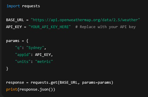
Step 2: Making the API Call
Using Python’s requests library, I sent a GET request to OpenWeatherMap’s API for each city.
Here’s a simplified example for Sydney:
The API responded with a JSON object containing temperature, humidity, pressure, and weather description, among other fields.
Step 3: Cleaning the Data
While JSON is easy for machines to read, it’s not the most human-friendly format for analysis.
I converted the JSON data into a pandas DataFrame, kept only the key columns, and formatted the date for readability.
Sample DataFrame output:
CityTemperature (°C)Humidity (%)Pressure (hPa)WeatherDateSydney20.5651012clear sky2025-08-11 05:00:00
Step 4: Analyzing the Data
From the dataset, I identified:
Warmest city at the time of the query
Coldest city
Humidity variations between cities
For example, Perth came out warmer, while Melbourne was cooler at the time of analysis.
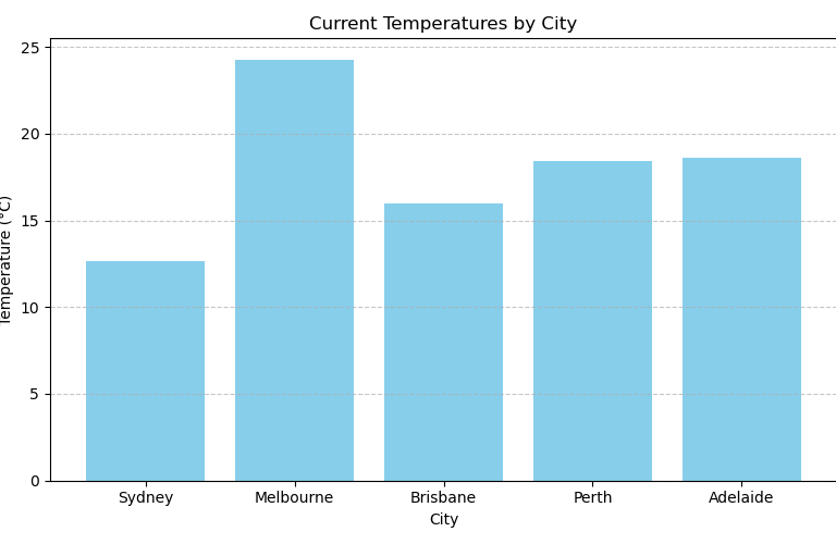
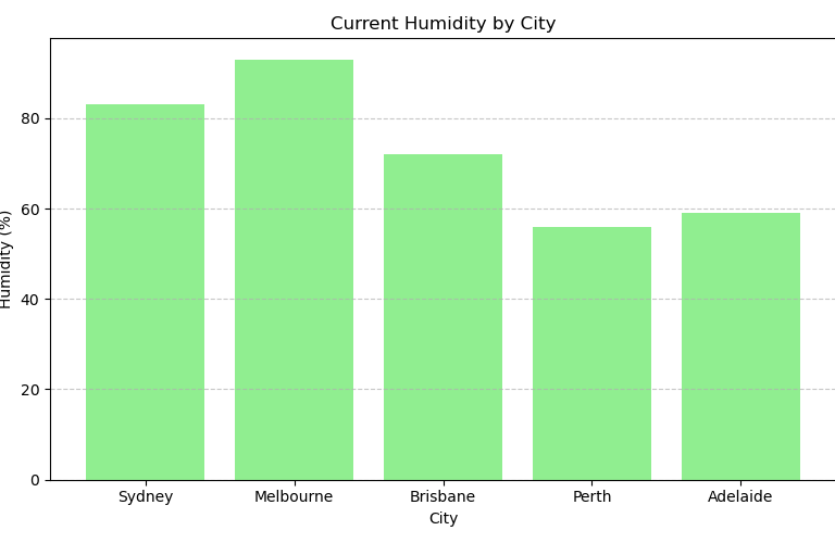
Step 5: Visualizing the Insights
To make the results more engaging, I created two bar charts with Matplotlib:
Temperature by City:
Humidity by City:
These visuals quickly communicate the differences in climate between cities at a glance.
Step 6: What I Learned
This project reinforced several important skills:
How to connect to and query an API using Python
How to parse and clean JSON data for analysis
How to create quick, clear visualizations that summarize key insights
It also reminded me that even small, time-boxed projects can provide valuable learning opportunities.
Next Steps
Some ideas for expanding this project:
Collect data daily to observe trends over time
Add more cities or compare different countries
Automate the script to update and publish insights automatically
Code & Files
You can find all the code and chart files for this project in my GitHub repository:
WeatherAPI – GitHub Repo
In one day, I went from connecting to a public API to producing a clean dataset and generating clear visual insights.
This is exactly the kind of workflow that makes APIs such a powerful tool in data analytics — and why they’re a skill every analyst should master.
If you run this yourself, swap in your own cities or even your own API of choice, and see what stories the data tells you.